
Art & Design
Introduction to Art and Design
At East Dene School we are artists! Our Art and Design curriculum has been designed after identifying barriers for children and creating four concepts known as our school drivers. Our school drivers are;
- creative collaborators,
- aspiring minds,
- memory makers
- our family, our community, our world.
We plan, deliver and evaluate our lessons by looking at the end points for drawing, painting and sculpture and the key learning they need to have been taught. Our curriculum provides all of our children from EYFS to Year 6, with opportunities to practice and develop skills and knowledge following a sequence of lessons. The sequence of lessons includes: understanding and explaining key vocabulary, exploring an artist and their artwork, practicing and developing new skills and techniques (drawing, paint or sculpture), creating a final piece of art work and evaluating their final piece. The topics provide our children with the knowledge of various artists (past and present day) and how to develop key elements of art such as; line, colour, shape, form, texture and tone. We allow children to develop and practice their skills and techniques over a number of lessons before applying them to a final piece of artwork. This allows our children to showcase their knowledge and skills they have acquired.
Curriculum Aims
At East Dene Primary School our curriculum aims to give every child the opportunity to become an artist.
We are Artists…
An artist is someone who uses creativity and imagination to make beautiful things. Artists share their unique way of seeing the world through their artworks in many forms like painting, sculpture, photography and more. If you have ideas and visions to express, you can be an artist too by finding your own style to create amazing art. 
Intent, Implementation, Impact
Intent:
At East Dene Primary School, we foster an understanding and enjoyment of art, craft and design. We aim to provide pupils with experience of a broad and balanced range of art activities, showing progression within these experiences. Pupils develop knowledge, ideas and techniques through the use of a sketchbook. We develop their ability to observe, investigate, respond to and record the world around them through a growing variety of forms and media. Pupils develop their use of a range of tools, media and processes. We aim to develop an understanding of the work of artists, craftspeople and designers and apply this knowledge to their own work. Pupils also study historical, cultural and religious art. Our art curriculum engages, inspires and challenges pupils, equipping them with the knowledge and skills to experiment, invent and create their own works of art. We strive to promote a lifelong love and appreciation of the visual arts.
Implementation:
- Pupils have weekly dedicated art lessons, as well as opportunities to apply art skills across the broader curriculum. Lessons allow time for both guided learning and open-ended creative exploration.
- The art curriculum progressively builds upon prior learning from year to year, increasing in complexity. Key concepts are revisited to allow consolidation of knowledge and skills.
- A wide range of high-quality materials and resources are available to pupils including paint, pastels, clay, textiles, collage materials and more.
- Artwork by famous artists and from different cultures is studied to inspire and expose pupils to diverse techniques and styles.
- Displays around the school celebrate pupils’ artwork and creativity.
- Specialist art workshops, visiting artists and gallery visits further enrich the curriculum.
Impact:
- Pupils are proud of their artwork and are eager to discuss the processes and techniques used.
- Sketchbooks show progression over time with growing creativity, skill and autonomy.
- Pupils develop a deepening understanding of the work of famous artists.
- The language of art is understood and used by pupils when evaluating their own and others’ artwork. Pupils leave the school with a love of art, eager to continue refining their skills. The art curriculum equips them with transferable skills such as problem solving, perseverance and creativity
Cultural Capital
At East Dene, our curriculum significantly enriches a child’s cultural capital in Art, Design, and Technology by providing a diverse array of creative opportunities and resources. The curriculum is designed to nurture artistic expression and technical skills through hands-on projects, trips, critical thinking and an exposure to a variety of artistic mediums and design principles. Students engage in activities that stimulate their imagination and critical thinking, such as creating original artworks, exploring cutting-edge technologies, and understanding the historical and cultural contexts of different art forms. This holistic approach not only enhances their artistic abilities but also instils a deep appreciation for the arts and fosters innovative thinking, preparing them for future academic and professional endeavours in a rapidly evolving world.
Progress Model
Art Curriculum Intent
At East Dene Primary School, we aim to offer opportunities for children to
• Foster an understanding and enjoyment of art, craft and design
• Experience a broad and balanced range of art activities and show progression within these experiences
• Show development of knowledge, ideas and techniques through the use of a sketchbook
• Develop their ability to observe, investigate, respond to and record the world around them through a growing variety of forms and media
• Develop their use of a range of tools, media and processes
• Develop an understanding of the work of artists, crafts people and designers and apply this knowledge to their own work
• Study historical, cultural and religious art.
The National Curriculum
Aims
The national curriculum for art and design aims to ensure that all pupils:
• produce creative work, exploring their ideas and recording their experiences
• become proficient in drawing, painting, sculpture and other art, craft and design techniques
• evaluate and analyse creative works using the language of art, craft and design
• know about great artists, craft makers and designers, and understand the historical and cultural development of their art forms.
Subject content
Key stage 1
Pupils should be taught:
• to use a range of materials creatively to design and make products
• to use drawing, painting and sculpture to develop and share their ideas, experiences and imagination
• to develop a wide range of art and design techniques in using colour, pattern, texture, line, shape, form and space
• about the work of a range of artists, craft makers and designers, describing the differences and similarities between different practices and disciplines, and making links to their own work.
Key stage 2
Pupils should be taught to develop their techniques, including their control and their use of materials, with creativity, experimentation and an increasing awareness of different kinds of art, craft and design.
Pupils should be taught:
• to create sketch books to record their observations and use them to review and revisit ideas
• to improve their mastery of art and design techniques, including drawing, painting and sculpture with a range of materials [for example, pencil, charcoal, paint, clay]
• about great artists, architects and designers in history
| Painting Y1 Artist: Kandinsky End Point: Rainbows Media: Powder Paint | ||||||
| Lesson number and focus | Connecting Learning (Retrieval practice) 5-10 minutes | Vocabulary Focus 5 minutes | Direct Instruction | Practice | Evaluation and Assessment (Plenary) 5 – 10 minutes | |
| Learning Focus Artist Study Who is Kandinsky? What are the primary colours? How does paint feel? | Can the chn recall any artist from EYFS that used paint? Can children name the three primary colours? | Identify vocab to be used in sequence of lessons. primary colours thick thin smooth texture palette | Artist: Kandinsky Explore Kandinsky’s Squares with Concentric Circles and discuss how he uses bright colours and repeated square shapes. Identify primary colours (red, blue, yellow) within his artwork. Teacher models talking about how paint feels and how brushstrokes look (thick, thin, smooth, textured) | Pupils experiment with primary colours on their palette, trying different brushstrokes. Children to explain using the language introduced | Can children name the work and artist? Can children apply associated vocab? | |
| Disciplinary Knowledge Development – Split into 3 sessions 1.Mixing colours on a palette 2.Explore squares and brushstrokes. 3.Develop a full set of rainbow colours | Pupils recap previous week’s learning – can they recall the artist/work and use the displayed image to discuss the colours. | Identify vocab to be used in today’s lesson. Build on previous lesson and weave in new vocab within the lesson. primary colours thick thin smooth palette | Demonstrate how to mix primary colours to make the full range of rainbow colours. Pupils practise mixing on a palette and test their colours in small squares. Encourage children to verbalise their process: “I mixed red and yellow,” “This paint feels smooth.” | Pupils mix rainbow colours confidently and begin explaining how colours are made | Look at partner/class work using visualiser or at the front. Can chn identify/discuss what they like/dislike about the features? Can chn use the vocab in their assessments? | |
| Pupils recap previous week’s learning – can they recall the artist/work and use the displayed vocabulary to label the artwork shown? | Identify vocab to be used in today’s lesson. Build on previous lesson and weave in new vocab within the lesson. texture | Examine how Kandinsky arranged colours inside squares and circles to create contrast and movement. Pupils create mini studies of squares, experimenting with different brushstroke qualities (smooth, textured, thick, thin). Children describe their choices using the vocabulary in action. | Children practise controlled brushstrokes and explore expressive colour placement. | Look at partner/class work using visualiser or at the front. Can chn identify/discuss what they like/dislike about the features? Can chn use the vocab in their assessments? | ||
| Pupils recap previous week’s learning – can they recall the artist/work and use the displayed vocabulary to label the artwork shown? | Recap all vocab from previously taught sessions and give examples of how to use the language in action. | Discuss the colour sequence of the rainbow and what tones they may need to create. Model mixing each rainbow colour/cleaning brushes/parts of the palette/water. Model creating rainbow squares with a focus on coverage of the area, controlled brushstrokes and consistency throughout. Model thoughts using language in action, how was the colour made? How do the paint feel? | Children create a complete rainbow colour set with accuracy and control. | Look at partner/class work using visualiser or at the front. Can chn use the vocab in their assessments? | ||
| Application of Knowledge (end point) Apply all skills to create a self-portrait in pencil. | Recap previous week’s learning – what did they practise making? | Recap essential vocab from the unit thick, thin, smooth, texture, mix, primary colours | Recap the skills developed over the previous weeks learning. | Children draw a grid of squares inspired by Kandinsky’s arrangement. Begin painting the first squares, selecting colours intentionally and considering expressive brushstrokes. | Children should be encouraged to explain their decisions: “I used a thick stroke,” “This square feels smooth.” | |
| Evaluation and Assessment | Set the class up as an art gallery for the children to be able to give feedback about the different skills that have been used in each painting | Share evaluation sentence stems including key vocabulary. | Model evaluating final paintings. | Children share and evaluate their work, describing how colours were made, how paint felt, and how they used different strokes for coverage. | Have children evaluated work appropriately using sentence stems and associated vocabulary/ techniques? | |
| Painting Y3 Artist: Frida Kahlo End point: Strong women – painting. Media: Watercolour/ powder paint paints | ||||||
| Lesson number and focus | Connecting Learning (Retrieval practice) 5-10 minutes | Vocabulary Focus 5 minutes | Direct Instruction | Practice | Evaluation and Assessment (Plenary) – 10 minutes | |
| Artist Study Introduction to Frida Kahlo’s life, art style, and self-portraits. Observe how she used colour to express mood and identity. | Discuss: “What is a portrait? What colours make a painting feel bright or calm?” | Identify vocab to be used in sequence of lessons. Hue, tone, tint, shade, warm colours, cool colours, complementary colours, layering, effect, blend | Show examples of Frida Kahlo’s portraits. Explain how warm colours (reds, oranges, yellows) can create energy, cool colours (blues, greens, purples) can feel calm. | Children create small colour swatches with watercolour and powder paints, exploring warm and cool hues. | Can children describe one warm and one cool colour they mixed and the effect it could create | |
| Disciplinary Knowledge Development – split over 2 sessions 1.Study facial features in Kahlo’s portraits and learn how expressions and features convey personality and strength. 2. Explore mixing tints (lighter colours) and shades (darker colours) and examine how Kahlo layered colour to create depth. | Recall warm and cool colours from Week 1. Discuss how colours might influence the mood of a portrait. | Identify vocab to be used in today’s lesson. Build on previous lesson and weave in new vocab within the lesson. Hue, tone, tint, shade | Demonstrate basic facial proportions and features using pencil. Show how tints and shades can be used to create dimension | lightly sketch a portrait for their final painting, labelling areas where they might use warm or cool colours. | Peer feedback: Can they describe areas where colour will add effect? | |
| Recall warm and cool colours, basic facial sketches. | Identify vocab to be used in today’s lesson. Build on previous lesson and weave in new vocab within the lesson Tint, shade, tone, layering | Demonstrate mixing colours to create tints and shades. Show how layering watercolour and powder paints can blend colours smoothly. | create colour swatches with multiple tints and shades, experimenting with layering to create effects | Students explain one colour choice using precise language: “I used a lighter tone of red to make this area feel soft.” | ||
| Application of Knowledge (end point) (two lessons to create entire piece) 1.Plan final portrait composition, consider colours, facial features, and symbolic elements 2. Begin painting final portrait using pointillism-inspired layering of watercolour and powder paints. | Recall tints, shades, warm/cool colours, and layering techniques | Identify vocab to be used in today’s lesson. Build on previous lesson and weave in new vocab within the lesson. Complementary colours, effect, blend | Show examples of complementary colours in Kahlo’s work. Demonstrate planning which colours to use in different areas to create effect. | Draw final composition lightly on paper and plan areas for complementary colours and layering effect. | Students explain colour choices: “I used complementary colours to make the background pop.” | |
| Recall planned colours and layout from Week 4 | Identify vocab to be used in today’s lesson. Build on previous lesson and weave in new vocab within the lesson. Hue, tone, layering, effect, blend | Demonstrate layering watercolour and powder paint, blending colours to achieve smooth transitions and depth. | Start applying base colours for skin, clothing, and background and then begin to experiment with layering to create effects | Peer discussion: Can they explain why they chose certain hues or tones for different areas? | ||
| Evaluation and Assessment | Review all techniques: tints, shades, tones, warm/cool, blending, layering Set the class up as an art gallery for the children to be able to give feedback about the different skills that have been used | Share evaluation sentence stems including key vocabulary. | Model evaluating final work. explain colour choices using precise language: “I used warm colours to make the face bright and cool colours in the background for contrast.” | Children evaluate own learning verbally. Ch use displayed key vocab to support. | Have children evaluated work appropriately using sentence stems and associated vocabulary/ techniques? | |
| Painting Y4 Artist: Sarah Taylor End point: Leopard portrait Media: Acrylic paint/watercolour paint | ||||||
| Lesson number and focus NB: Due to alternating lessons the Artist Study will be weaved into all lessons rather than a standalone. | Connecting Learning (Retrieval practice) 5-10 minutes | Vocabulary Focus 5 minutes | Direct Instruction | Practice | Evaluation and Assessment (Plenary) – 10 minutes | |
| 1. Paint techniques: flat wash, transparency and layering | Recall prior brush control, washes and colour mixing. | Layering Contrasting Layering Depth Lesson 1 – Flat wash, transparency, layering | Briefly show Sarah Taylor’s animal portraits. Model flat washes with watercolour, layering when dry and thick acrylic marks; compare transparent and opaque effects. | Create a technique sampler: background flat wash, layered transparent washes and thicker textured marks. Label effects. | Which application is transparent? Which creates texture? Explain choices using vocabulary. | |
| 2. Colour, blending and gradients | Review samples: which techniques made lighter/darker effects? | Lesson 2 – Blend, gradient, contrast | Refer to Taylor’s colour choices. Model mixing harmonious and contrasting colours, blending adjacent colours and creating gradients for light and shadow. | Produce colour studies for a leopard portrait: blended gradient strips and small harmonious/contrasting palette tests. | Explain which palette creates the intended mood and how gradients suggest form. | |
| 3. Practising texture and depth | Retrieve layering, gradients and opacity from Lessons 1–2. | Lesson 3 – Underpainting, texture, highlight | Model a small single-tone underpainting; after drying, add layered short strokes/dabs for fur, markings and highlights. Show how contrast creates depth. | On small practice sections (not final artwork), make a tonal underpainting, then build fur textures, spots and highlights using controlled marks. | Identify the most successful brushstrokes; say what to refine before the final portrait. | |
| 4. Final outcome: leopard portrait | Revisit technique samples and chosen colour palettes. | Lesson 4 – Composition, depth, refine | Show a short sequence: plan/outline, flat wash and underpainting, build layers, add fur details and highlights. Refer briefly to Sarah Taylor as inspiration. | Create one completed leopard portrait. Use a prepared outline if needed to protect painting time; apply practised techniques and refine details. | Gallery walk and brief self-evaluation: “I used ___ to create ___.” “I refined ___ because ___.” | |
| Painting Y5 Artist: Pete McKee End point: Work linked to his local art Media: Acrylic and powder paint | ||||||
| Lesson number and focus | Connecting Learning (Retrieval practice) 5-10 minutes | Vocabulary Focus 5 minutes | Direct Instruction | Practice | Evaluation and Assessment (Plenary) – 10 minutes | |
| Artist Study Explore Pete Mekee’s work and understand basic composition and perspective in landscapes. | Ask students: “What do you know about perspective and landscapes?” Review previous knowledge of foreground and background in art | Identify vocab to be used in sequence of lessons. perspective, foreground, background, monochrome, impasto, scumble, focal point, atmospheric effect | Show Pete Mekee’s paintings of Sheffield/Rotherham and discuss how he uses perspective and placement of objects to create depth and focal points. | Sketch a simple local scene in pencil, identifying foreground, middle ground, background, and focal point. Encourage labelling the areas for clarity. | Students share sketches with a partner, describing how they used perspective and established a focal point | |
| Disciplinary Knowledge Development – Spilt over 2 sessions 1.Explore how monochrome painting and atmospheric effects can create mood and depth. 2. Learn how texture and impasto techniques affect visual impact | Recap foreground, background, perspective, and focal point from Week 1 | Introduce monochrome, atmospheric effect. Discuss how colour (or lack of) influences mood and spatial depth. | Demonstrate creating a simple monochrome study using one colour in varying shades. Show how lighter/darker tones create atmospheric perspective. | Students create a monochrome study of their sketch from Week 1. Encourage experimenting with tonal differences to suggest distance (atmospheric effect). | Students discuss how using monochrome affected the mood of the scene. Adult highlights effective use of atmospheric effect and foreground/background contrast | |
| Review Week 2 monochrome studies and atmospheric depth techniques | Introduce impasto, scumble. Show examples in Mekee’s work or similar textured paintings | Demonstrate impasto technique: thick paint applied with brush/knife. Demonstrate scumbling: lightly brushing opaque/transparent paint over dry layers to create texture | Experiment with impasto and scumbling on small sample areas. Discuss how texture changes the visual impact and mood | Peer discussion: “Which technique creates more texture or depth?” Students explain in terms of impasto, scumble, and overall effect on focal points. | ||
| Application of Knowledge (end point) (two lessons to create entire piece) 1.Plan the final piece using perspective, focal points, and techniques learned 2. final painting using acrylic/powder paint, blocking in shapes and basic tones. | Recap impasto, scumbling, monochrome, atmospheric effect | Revisit perspective, foreground, background, focal point, atmospheric effect. Discuss how these can guide composition. | Demonstrate how to plan a painting from a local photograph or scene, marking areas for foreground, middle ground, and background. Discuss where to place the focal point and where to use impasto/scumbling for impact. | Students create a detailed plan/sketch for their final piece. Annotate where techniques will be used for texture, depth, and focal emphasis | Students share plans and explain their use of vocabulary and technique choice | |
| Review Week 4 plans and discuss where impasto, scumbling, and atmospheric effects will be applied. | Introduce monochrome underpainting if desired. Emphasize revisiting foreground, background, perspective in painting process | Demonstrate blocking in large shapes and areas of light/dark. Emphasize layering and preparation for texture techniques | Students begin their painting, applying underpainting or initial colour blocks. Ensure attention to spatial arrangement and perspective. | Peer reflection: “Which areas have strong perspective? Where will texture techniques be added next?” | ||
| Evaluation and Assessment | Set the class up as an art gallery for the children to be able to give feedback about the different skills that have been used | Share evaluation sentence stems including key vocabulary. | Model evaluating final work. Gallery walk and peer discussion. Students describe how techniques influenced visual impact using painting-specific vocabulary. | Children evaluate own learning verbally. Ch use displayed key vocab to support. | Have children evaluated work appropriately using sentence stems and associated vocabulary/ techniques? | |
| Drawing Y6 Artist: Banksy End Point: Graffiti Art Media – Acrylic and powder paint | ||||||
| Lesson number and focus | Connecting Learning (Retrieval practice) 5-10 minutes | Vocabulary Focus 5 minutes | Direct Instruction | Practice | Evaluation and Assessment (Plenary) – 10 minutes | |
| Artist Study Explore Banksy’s art, discuss realism vs abstract, and understand composition. | Ask: “What do you know about graffiti art and street art?” Recall previous painting techniques, colour mixing, and brushwork | Identify vocab to be used in sequence of lessons. abstract, realism, expressive, muted, vibrant, tonal value, chiaroscuro, composition, visual impact, refine | Introduce realism, abstract, composition, visual impact. Discuss examples in Banksy’s work: realistic stencils vs abstract graffiti elements Show examples of Banksy’s work; discuss how composition directs the viewer’s eye and compare realistic stencils to abstract elements and their visual impact | create a small sketch for a graffiti design, considering composition and style (realistic or abstract). Label areas for visual focal points | Can children discuss their chosen composition and style, using composition and visual impact in their explanation. | |
| Disciplinary Knowledge Development – Spilt over 2 sessions 1. Explore muted and vibrant colours and tonal value to convey mood. 2. Explore chiaroscuro and the use of light and shadow to add visual impact. | Review sketches and discuss style choices from Week 1. | Introduce muted, vibrant, tonal value, expressive. Discuss how colour intensity and tonal value affect mood and style | Demonstrate mixing muted vs vibrant colours; show how tonal value creates depth and emphasis. Show Banksy examples where muted backgrounds highlight the stencil subject | create a small colour study for their graffiti design using muted and/or vibrant colours. Experiment with tonal value to emphasize focal points. shapes. | Peer discussion: “How does colour choice change the mood and visual impact?” Students explain using tonal value, muted, vibrant, expressive. | |
| Recap colour studies and previous tonal work | Introduce chiaroscuro; recap tonal value, visual impact | Demonstrate adding shadows and highlights to create depth and dramatic impact in a stencil or abstract design. Show examples from Banksy and other graffiti artists. | Apply chiaroscuro techniques to their graffiti sketch, enhancing depth and focus. Encourage observation of how light and shadow affect perception of realism or abstraction . | Students explain how chiaroscuro changes the visual impact of their work. Peer feedback on tonal contrasts and focus areas | ||
| Application of Knowledge (end point) (two lessons to create entire piece) 1.Introduce expressive painting techniques and begin refining design 2. Apply all learned techniques to final painting | Review chiaroscuro practice and tonal impact from Week 3 | Introduce expressive, refine; revisit composition, visual impact | Demonstrate expressive brushwork or mark-making to enhance style. Show how refinement can improve composition and emphasis | Apply expressive techniques to add texture, marks, or paint effects to their design. Begin refining lines, shapes, and composition for clarity and impact. | describe which areas they refined and how expressive techniques change the mood or style. | |
| Recap colour, tonal value, chiaroscuro, expressive techniques, and refinement | Revisit muted, vibrant, tonal value, chiaroscuro, expressive, refine, visual impact | Demonstrate layering techniques, using acrylic/powder paint for texture and vibrancy. Discuss composition adjustments before final painting. | Begin final painting, blocking in colours and applying tonal and expressive techniques. Focus on visual impact, composition, and chosen style (realistic vs abstract). | Quick peer discussion on areas of strength and where further refinement is needed | ||
| Evaluation and Assessment | Review progress, highlight areas for final refinement | Recap all key terms: abstract, realism, expressive, muted, vibrant, tonal value, chiaroscuro, composition, visual impact, refine | Gallery walk: students describe their work using advanced painting vocabulary. Peer and teacher feedback focused on technique, visual impact, and expressive quality. . | |||
Progression of Language
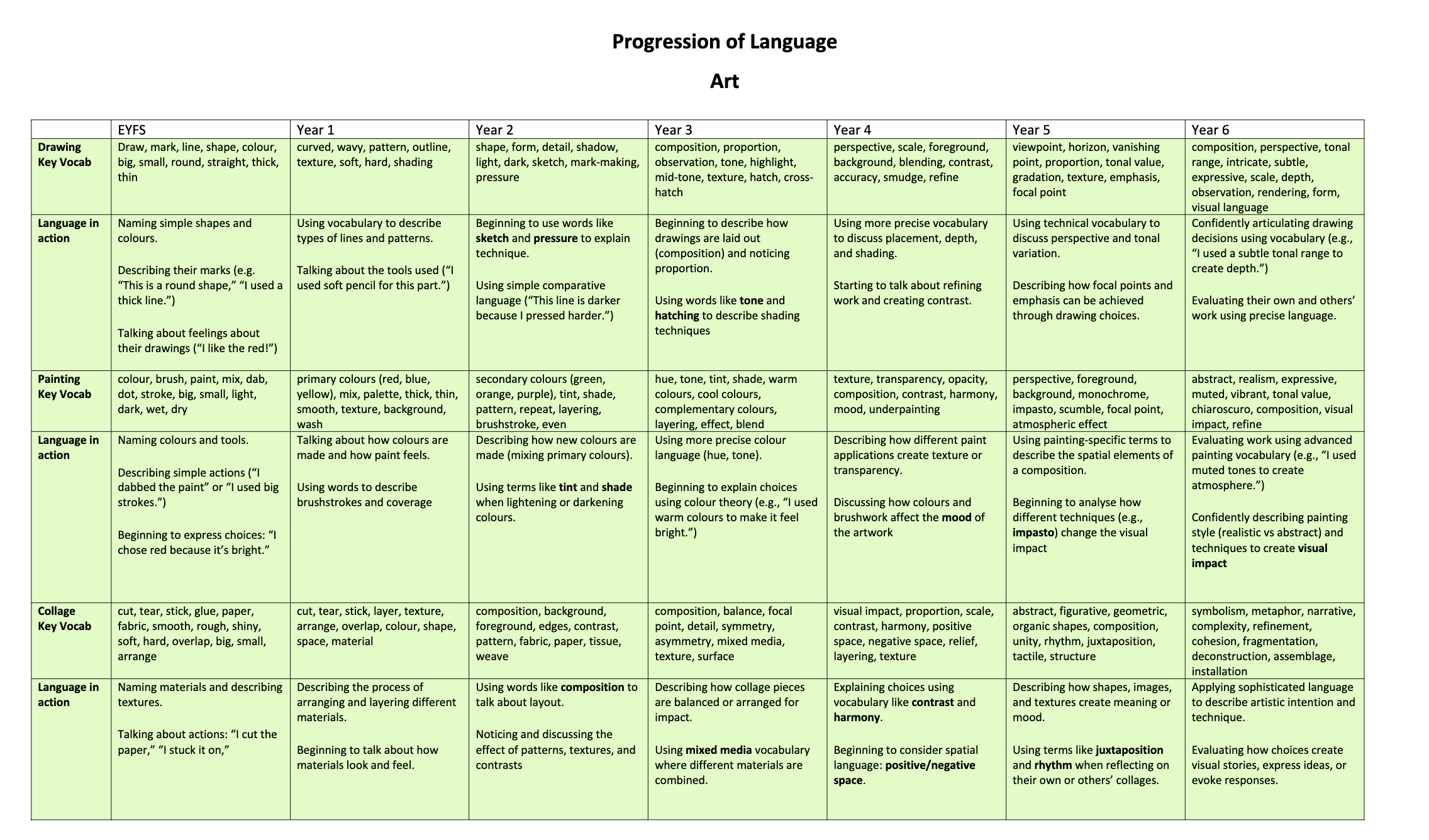
Research around the Curriculum
Concepts
At East Dene, we understand the necessity of providing children with opportunities to revisit previous learning, committing knowledge to their long-term memories. In order for this to happen in art, we have carefully considered the concepts and knowledge that children will be taught and how these will be revisited and built upon each year, from EYFS through to Year 6.
In our art curriculum, we have categorised the concepts into primary key concepts, supplementary key concepts and integral concepts, with the latter being referred to during most units of work. The formal elements of art are known as our key concepts (primary and supplementary) that are taught through each block of learning, across the different mediums being taught and developed each year: Colour, Pattern, Texture, Line, Shape, Form and Space. These key concepts are the formal elements of art, and are the building blocks of any work of art. When we analyse any work of art, we analyse these elements to see how they combine to create the overall effect of the artwork. Formal elements can be both practical and theoretical, and it isn’t necessary to be able do both to understand them. When we analyse any drawing, painting, sculpture or design, we examine these component parts to see how they combine to create the overall effect of the artwork.
These elements have a relationship to one another:
- Most images begin their life as line drawings.
- Lines cross over one another to form shapes.
- Shapes can be filled with tone and colour, or repeated to create pattern.
- A shape may be rendered with a rough surface to create a texture.
- A shape may be projected into three dimensions to create form.
Each of the elements may also be used individually to stress their own particular character in an artwork.
The table below outlines how the primary and supplementary key concepts have been mapped out within our art curriculum:

In addition to the key concepts outlined above, we have our integral concepts, which are taught and referred to within the majority of art units at East Dene. Source, style, movement & periods and themes are introduced from KS1; observation and reflection (along with the key concepts above) are introduced from Foundation Stage. An explanation of these concepts is outlined below:

Examples of Planning
Useful Websites
Here are some useful websites for parents to help children with art at home:
The Crayola website has lots of art activities, crafts, and ideas for parents to do with kids of all ages. They provide materials lists, step-by-step instructions, and photos.
The Artful Parent has art project ideas organized by age and medium like painting, drawing, sculpting, and mixed media. There are also tips for parent and managing art supplies.
Red Ted Art shares easy arts and crafts activities to do with children using everyday items found around the home.
The Imagination Tree provides open-ended creative art prompts and ideas to spark kids’ imaginations during art and craft time.
https://theimaginationtree.com/
The Tucson Museum of Art offers printable worksheets based on art in their collections. The activities are great for fine motor skills.
https://www.tucsonmuseumofart.org/
Tate Kids from the Tate museums has art activities, quizzes, and videos to get kids engaged in art.
The Met Museum provides interactive online art-making activities for kids inspired by works in the museum’s collection.
Drawing Glossary
EYFS (Nursery & Reception)
- Draw
To make marks or pictures using a pencil, crayon, or chalk. - Mark
A mark is any line, dot, or scribble you make on paper. - Line
A line is a mark that moves from one point to another. It can be straight, wavy, or curved. - Shape
A flat space made when lines join together, like a circle or square. - Colour
Colour is what we see when light hits something. Red, yellow, and blue are colours. - Big / Small
Big means large; small means little. We use these words to describe size. - Round
Round means curved like a circle or ball. - Straight
Straight means a line that doesn’t curve or bend. - Thick / Thin
Thick lines are wide; thin lines are narrow.
Year 1
- Curved
A line that bends smoothly without sharp angles. - Wavy
A line that moves up and down like waves. - Pattern
When shapes, lines, or colours repeat over and over. - Outline
The outside edge of a shape or drawing. - Texture
How something looks or feels, like rough or smooth. - Soft / Hard
Soft marks are light and gentle; hard marks are darker and stronger. - Shading
Making part of a picture darker to show shadow or depth.
Year 2
- Shape
A flat, enclosed space, like a circle, triangle, or square. - Form
A shape that looks 3D, like a cube or sphere. - Detail
Small parts added to make something more interesting or real. - Shadow
A dark area made when light is blocked. - Light / Dark
Light is bright; dark is deep or shaded. Artists use both to create contrast. - Sketch
A quick, light drawing to plan ideas. - Mark-Making
Using different lines, dots, or scribbles to create texture or pattern. - Pressure
How hard or softly you press with your pencil or crayon.
Year 3
- Composition
How everything is arranged in a picture. - Proportion
The right size of one part of a drawing compared to another. - Observation
Looking carefully at something before drawing it. - Tone
How light or dark an area of a drawing is. - Highlight
The brightest part of an object where light hits. - Mid-Tone
A shade that is between light and dark. - Texture
The look or feel of a surface in a drawing. - Hatch / Cross-Hatch
Hatch: lines close together. Cross-hatch: lines crossing over each other to show tone.
Year 4
- Perspective
Making things look like they go back into the distance. - Scale
How big or small something is in a picture compared to other things. - Foreground / Background
Foreground is the front; background is the far part behind. - Blending
Gently mixing colours or shades so they flow smoothly. - Contrast
The difference between light and dark or bold and soft. - Accuracy
Drawing something carefully and correctly. - Smudge
Rubbing pencil or charcoal to soften edges or create shadow. - Refine
To improve and add small details to a drawing.
Year 5
- Viewpoint
The angle you see something from (above, side, front). - Horizon
The line where the sky meets the ground. - Vanishing Point
A spot on the horizon where lines seem to meet in the distance. - Proportion
The right size and position of one part of a drawing to another. - Tonal Value
The range from light to dark in a drawing. - Gradation
When colour or tone changes slowly from light to dark. - Texture
How something looks like it would feel in real life. - Emphasis
Making something stand out in a picture. - Focal Point
The most important part of the picture that draws your eye.
Year 6
- Composition
How every part of a picture is arranged to create balance or drama. - Perspective
Making objects look smaller as they get further away. - Tonal Range
Using light, mid, and dark tones to add depth and contrast. - Intricate
Something very detailed and carefully done. - Subtle
A gentle or soft change in colour, tone, or line. - Expressive
Showing feelings or mood through drawing. - Scale
The size of one object compared to others in the picture. - Depth
Making a picture look like it has space going back or forward. - Observation
Looking very closely to capture details. - Rendering
Adding tone, texture, and detail to make something look realistic. - Form
The 3D shape of an object. - Visual Language
Telling a story or sharing an idea through images instead of words